Spring has begun its gentle slide into summer and whenever I'm out and about I've tried to snap photos as much as I can. All the photos in this post were taken on my camera phone as I've been trusting it far more lately to capture a good image for me. I've also been increasingly aware that the shapes and features that attract my eye in the landscape also feed into my approach to the jewellery I design and create.
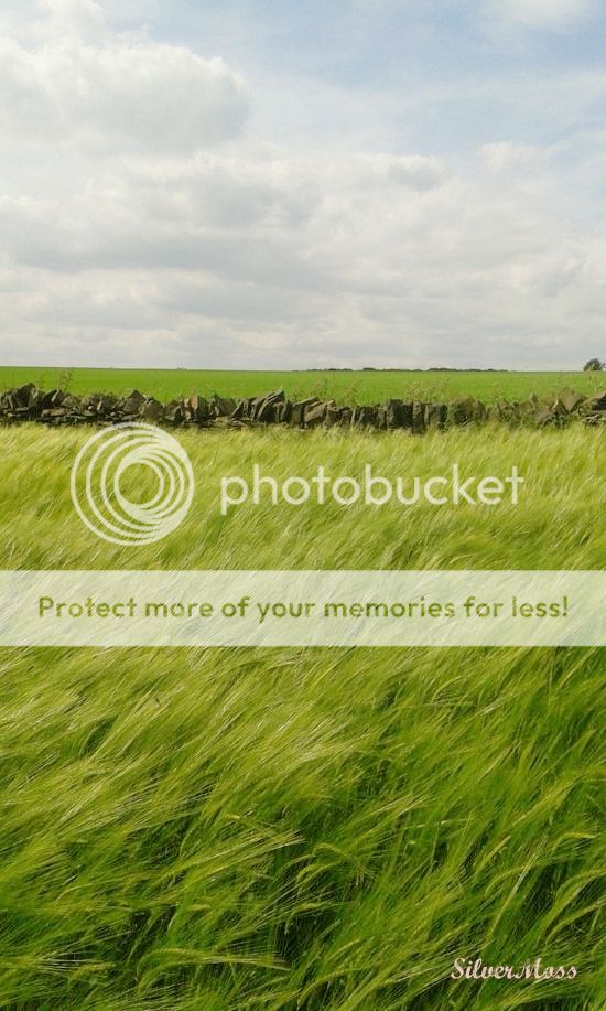
The photo above of a green wheat field, backed with a wall, then a further field, and then the sky beyond made me consider the importance of both pattern and uniformity in jewellery design as well as aspects that break one or both of those qualities. Yes, the lines of the features in the photo run parallel to each other, but the spaces between those lines are all different - wide, narrow, narrow, wide and so they add interest and break expectations of a uniform pattern.
Creating differences through contrast in design is often pleasing - we naturally recognise rhythm and anything that alters or interupts it. The texture of the wheat itself, being pushed by the breeze, within the overall stripe it forms, shows how effective angles can be when set against horizonal patterns and shapes. And the clouds in the skyscape provide a rounded texture in contrast with all the lines in the photo, serving as a reminder how texture can be used as a subtle contrast.
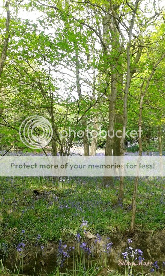
This photo was taken late into bluebell time, when I nearly missed the best of the blooms through a rather weighty migraine that kept me hidden away instead of experiencing the flowers at their most blue. But even here in this image, the carpet effect is still in evidence and the trees, as ever, provide a protective canopy against the harshness of direct sunshine and beautiful spots of light falling on the flowers.
If you imagine the scene without the blue hues then it becomes a little drab, something a little plain - the bluebells add interest and texture and show how detail can lift a design which, while still attractive, may also be a little flat without it.
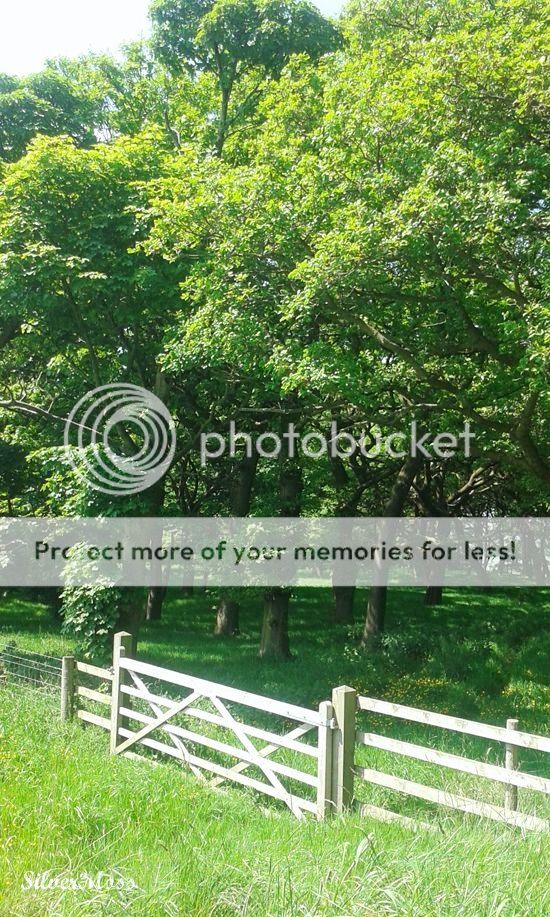
The contrast between the sunlight falling on the wooden gate and fence and the gentler dappled shade in the woodland prompted me to take this photograph. Contrast adds interest in jewellery design, as do angles, like the one that the gate and fence are on which helps draw the eye through the image, and prevent a one-dimensional quality by adding depth. In jewellery, the fact it is three-dimensional and tactile is one of its great strengths and allows freedom in design to create that sense of movement within each piece.
I'm really enjoying examining the photos I take a little more closely, choosing a few of my favourites and thinking about why I took them and like them so much and how certain elements of design manifests in my jewellery designs as well.
Do share anything you've noted in these images, or in any others you yourself may have taken, and leave a comment below. And if you fancy seeing my earlier posts on photographic inspiration they are here (on the seaside) and here (on flowers).

The photo above of a green wheat field, backed with a wall, then a further field, and then the sky beyond made me consider the importance of both pattern and uniformity in jewellery design as well as aspects that break one or both of those qualities. Yes, the lines of the features in the photo run parallel to each other, but the spaces between those lines are all different - wide, narrow, narrow, wide and so they add interest and break expectations of a uniform pattern.
Creating differences through contrast in design is often pleasing - we naturally recognise rhythm and anything that alters or interupts it. The texture of the wheat itself, being pushed by the breeze, within the overall stripe it forms, shows how effective angles can be when set against horizonal patterns and shapes. And the clouds in the skyscape provide a rounded texture in contrast with all the lines in the photo, serving as a reminder how texture can be used as a subtle contrast.

This photo was taken late into bluebell time, when I nearly missed the best of the blooms through a rather weighty migraine that kept me hidden away instead of experiencing the flowers at their most blue. But even here in this image, the carpet effect is still in evidence and the trees, as ever, provide a protective canopy against the harshness of direct sunshine and beautiful spots of light falling on the flowers.
If you imagine the scene without the blue hues then it becomes a little drab, something a little plain - the bluebells add interest and texture and show how detail can lift a design which, while still attractive, may also be a little flat without it.

The contrast between the sunlight falling on the wooden gate and fence and the gentler dappled shade in the woodland prompted me to take this photograph. Contrast adds interest in jewellery design, as do angles, like the one that the gate and fence are on which helps draw the eye through the image, and prevent a one-dimensional quality by adding depth. In jewellery, the fact it is three-dimensional and tactile is one of its great strengths and allows freedom in design to create that sense of movement within each piece.
I'm really enjoying examining the photos I take a little more closely, choosing a few of my favourites and thinking about why I took them and like them so much and how certain elements of design manifests in my jewellery designs as well.
Do share anything you've noted in these images, or in any others you yourself may have taken, and leave a comment below. And if you fancy seeing my earlier posts on photographic inspiration they are here (on the seaside) and here (on flowers).

No comments:
Post a Comment
Thanks so much for leaving a comment here - I always love to read them and I do my best to reply to them all, either here or by email.